
As a follow up on Alberto’s 2009 ‘Me in Logos’ post, finally a next part…
Now with everyday snapshots…
Of course all my life I have always loved logos. However some pictures below I guess go a bit further and beyond just a passion for logos. I guess you could name it ‘corporate brand idolization’. Please understand I am not this passionate about every brand. Just a few though. When visiting my dear sister in California back in 2005, enough for my coming out though of a brand groupie idolizing some of my favorite dotcom and technology brands like Apple and Google. What better place to visit than Silicon Valley?
Below are some snapshots my dear sister has taken against her willing. Please note: my little nephew is in the picture also against his willing. This because my sister had to operate the camera and after driving through Cupertino and Mountain View for a couple of hours finding the best Kodak spots and dodging the Google great lawn guards, my nephew got fed up sitting in his Maxi Cosi. Sorry Navarre.


So much for the highlights of my California trip, I’ll spare you the complete album.
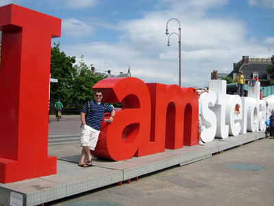
Back in Amsterdam. As a very proud Amsterdam resident, I was very happy seeing the 2005, by KesselsKramer designed, ‘I amsterdam’ logo and branding for the first time. I was even more euphoric when I saw the real life 3D logo on the Museum square. I finally seized my Kodak moment when this moving logo, making its tour through the nicest sites of Amsterdam, got placed next to the Beurs van Berlage in snowy December. My sweet girlfriend took my picture as I was standing next to the letter ‘I’.

Speaking of my girlfriend… She’s the one that got me a little Nipper statue.
Also I persuaded my sweetheart to also pose with her favorite brand…


The reason I share these pictures with you is because I really like logo usage in everyday life on signages, walls, etc. I would really like to start a collection on this and want to ask you to share your posings together with your favorite brand or logo. Don’t be ashamed, people do it with rockstars all the time ![]()
Of course you can post your comments below, but to make life easier I put up a Facebook album for it as well, please use this link to upload your photos. Please leave a little note with your picture so that we can enjoy your stories as well.

 Ever wondered what your logo-IQ is? I don’t think you have. I think right now you’re thinking my ‘logo-what?’. Well, in fact it’s really not that important nor interesting to know. There are companies though that do find it very interesting and important to know how well their logos score in a logo-IQ test like


 Every year before the new season begins football clubs all over Europe (and I assume elsewhere in the world as well) change their kits. Reason behind is is of course marketing. This leads (hopefully) to more sales as loyal fans dutifully upgrade to the new shirt each year.
